A corporate identity is more than a single logo file. The real test begins when the logo is used by different people across social media, websites, proposals, packaging, signage and internal documents. A clear brand guideline keeps those touchpoints recognisably connected.
A useful guide does not turn every design decision into a long presentation. It helps people select the correct asset, colour, typeface and layout. Adobe’s approach to brand style guides also recommends documenting the brand definition, logo, colour, typography, imagery and voice together with practical usage rules.
Define the scope and audience first
Do not assume that only designers will read the guide. Social media managers, developers, printers, agencies, sales teams and external suppliers may all need it. Keep the technical detail while using language that supports daily decisions.
Clarify which channels the guide covers, who can edit templates, which assets require approval and whether print and digital files are managed separately. A small business may need a concise foundation, while a brand working across packaging, advertising, video and multiple languages needs a broader system.
Describe the brand in practical terms
Before visual rules, explain the purpose, audience, values, positioning and personality in short usable sections. Replace broad adjectives such as “innovative” with behaviours: does the brand simplify complex information, speak technically, feel energetic or remain calm and precise?
Include examples of appropriate and inappropriate voice. Headline strength, form of address, specialist terminology, emoji use and calls to action affect consistency as much as colour and layout.
Document the logo family and its hierarchy
Show the primary logo and only the variations that have a real purpose: horizontal, stacked, symbol, wordmark, monochrome, black and white. Explain when each version is primary, secondary or required.
Define clear space, minimum size and alignment with diagrams. State how the clear-space unit is derived so different users do not invent different proportions. Test minimum size separately for print and screens.
Include incorrect-use examples
- Stretching or compressing the logo.
- Adding unapproved colours, outlines, shadows or effects.
- Placing it over a background that reduces legibility.
- Changing the relationship between symbol and wordmark.
- Enlarging a low-resolution raster file.
- Combining the logo with new text or graphics as a new lock-up.
Use the logo design brief guide to define goals and applications, and the logo file formats guide to plan delivery.
Give every colour a role
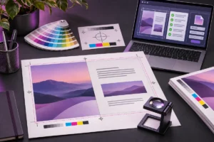
Identify primary, secondary, accent, neutral, text and status colours. Show approved background combinations, logo colours and pairings to avoid. Record HEX and RGB for digital use, plus CMYK or spot-colour information when required for production. Note that printed results depend on paper, ink, profile and production conditions.
The brand colour palette guide explains this workflow in more detail.
A brand colour is not automatically suitable for small text. WCAG 2.2 specifies at least 4.5:1 contrast for normal text and 3:1 for large text, with logotypes among the exceptions to this specific text contrast rule. Measure combinations used in websites and interfaces. For a broader review, see the website accessibility guide.
Define typography by function
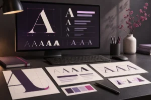
A typeface name alone is not a typography system. Define roles for primary headings, subheadings, body copy, short emphasis, numbers and interface labels. For each role, show the family, weight, size range, line height, letter spacing and case treatment. Keep print and web measurements separate.
Create a safe fallback stack for office documents, email and external presentations. Test Turkish and English characters as well as any additional alphabets, currency signs and symbols the brand needs.
Record font licensing in the technical notes. Adobe Fonts currently permits personal and commercial project use, but a client who needs direct access to edit with the font may need their own licence. Adobe web fonts must be used through the provided embed code; self-hosting the files can require a separate licence. Terms differ between providers, so record the source and current licensing route rather than copying font files into a shared folder.
Explain imagery with selectable examples
“Use modern photography” is not enough. Define framing, lighting, people, background density, colour temperature, retouching level and product scale with positive and negative examples. If the system uses illustration, icons, 3D assets or AI-generated imagery, explain where each approach is appropriate and how it relates to photography.
Document the grid, corner treatment, line weight, texture, shadow, frame and accent elements that form the graphic language. Separate core brand devices from effects reserved for specific campaigns.
Separate social, web and print applications
One sample layout cannot represent every channel. Include controlled examples for profile images, posts, stories and video covers; website heroes, buttons, forms and mobile layouts; and relevant print pieces such as business cards, catalogues or packaging.
Examples should not turn every design into the same template. Identify fixed brand elements and flexible campaign elements so the team can remain consistent without losing creative range.
Make file management part of the system
Rules cannot help if approved assets are difficult to find. Document the master asset location, version method and naming convention. Separate source files, print outputs, digital vectors, PNG previews, font notes and templates.
Replace names such as “final-final-2” with a structure that identifies the brand, asset, variation, colour mode, language and version. Archive older assets, but provide one clearly approved current source. Display the guide’s revision date and maintain a short change log.
Test the guide with real tasks
Before delivery, use the guide to create a small social cover, a light and dark web placement, a monochrome print and a horizontal banner. If the correct decision is still unclear, the guide needs a better explanation. Clarify the decision logic instead of adding pages without purpose.
Treat the guideline as a maintained document. When a new channel, product line or sub-brand appears, record how it relates to the main system and when older templates stop being approved.
Pre-delivery checklist
- Are purpose, audience and personality explained briefly?
- Are logo variations, clear space, minimum size and misuse shown?
- Are colour roles and digital/print values separated?
- Are typography roles, fallbacks and licensing notes recorded?
- Are photography, illustration, icon and graphic styles demonstrated?
- Are social, web and print needs shown separately?
- Is the naming, folder and version system clear?
- Has someone outside the design team tested the guide on a real task?
A good guide accelerates decisions
The purpose of brand guidelines is not to make every design identical. It protects the decisions that make the brand recognisable while giving new applications a shared starting point. A system that explains why, links to the correct asset and shows real examples makes work easier for both the brand owner and the creative team.
For a professional logo, identity system and organised delivery package, review my graphic design services or share the project scope through the contact page.