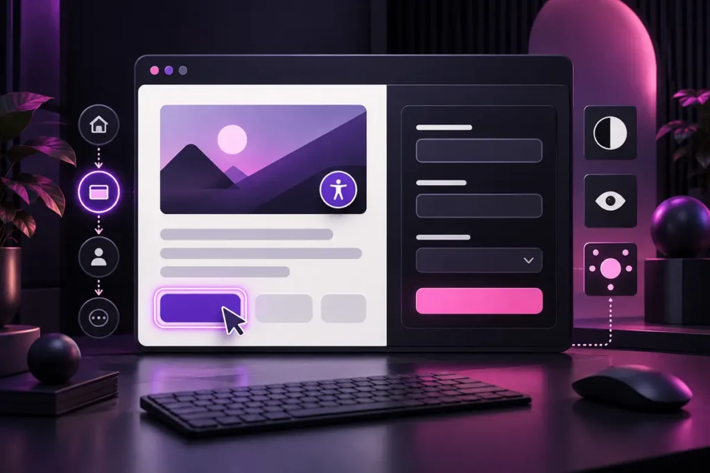
A website delivers a stronger digital experience when it is not only attractive but also usable by people with different visual, auditory, motor and cognitive needs. Accessibility is not a badge added at the end of a project. It is an ongoing approach that connects content, interface design and development decisions.
W3C’s Web Content Accessibility Guidelines (WCAG) 2.2 organise accessibility around content that is perceivable, operable, understandable and robust. This guide turns common visual and interaction issues into a practical review workflow for business websites. It is not, by itself, a claim of complete conformance or legal compliance, but it can help teams identify important problems earlier.
Write alternative text for the image’s purpose
Not every image needs the same kind of alternative text. W3C’s image guidance recommends that an informative image briefly communicates the essential information it contributes in its current context. For a functional image used as a link or button, the alternative should describe the action or destination rather than its appearance.
A purely decorative image should normally use alt="" so a screen reader can skip it. A chart or complex diagram may need a fuller explanation in the page content, not only a short alt attribute. Avoid turning alt text into a list of keywords; describe what a user would otherwise miss.
For file size and format decisions, see the website image optimisation guide.
Measure contrast instead of judging it by eye
Under WCAG 2.2 Level AA, normal text and images of text need a contrast ratio of at least 4.5:1, while large text needs at least 3:1. Logotypes are among the stated exceptions to this specific text contrast requirement, but navigation, body copy and button labels are not automatically exempt.
Test button text, links, form errors, disabled states and copy placed over photographs or gradients. When a background varies, check the weakest area or provide a stable surface behind the text. Do not use colour as the only way to communicate an error or state; combine it with text, shape or another clear cue.
Navigate the whole page with a keyboard
W3C requires functionality to be operable through a keyboard interface wherever the underlying action does not depend on freehand movement. Put the mouse aside and use Tab, Shift + Tab, Enter, Space and arrow keys where appropriate. Check menus, dialogs, tabs, forms and media controls.
The focus order should follow a sensible page flow, and the focused element must remain visible. Removing the browser outline for visual reasons can make the interface unusable for sighted keyboard users. Create a clear :focus-visible treatment that fits the brand while standing out from adjacent colours.
Make controls easy to activate
Small icons placed close together are difficult to select on touchscreens. WCAG 2.2 defines a minimum pointer target of 24 × 24 CSS pixels, with stated exceptions including sufficient spacing and inline links. Treat this as a baseline and consider larger active areas for important actions.
Give icon-only buttons an accessible name. Replace vague link labels such as “click here” with text that explains the destination. Use consistent names for repeated actions across the website.
Do not replace form labels with placeholders
W3C recommends labels that identify text fields, checkboxes, radio buttons and select controls. Where possible, explicitly associate a <label> with the matching control through its for and id values.
Placeholder text disappears when typing begins and is not a dependable substitute for a persistent label. Explain required fields, expected formats and error recovery clearly. When validation fails, provide understandable feedback connected to the relevant field rather than relying only on a general message at the top of the page.
Use a meaningful heading structure and correct language
Headings are not only large text; they describe the structure of the content. Keep a logical hierarchy and use CSS for visual sizing instead of choosing a heading level for appearance. Set the page language correctly, and ensure navigation, form labels, errors and alt text are translated in each language version.
For a new project, identify audiences, content types, forms and interactions before design begins. The website preparation guide provides a useful starting checklist.
A practical pre-launch checklist
- Do informative images have context-appropriate alt text?
- Are decorative images marked with empty alt text?
- Have text and interface contrast values been measured?
- Can every function be completed with a keyboard?
- Is keyboard focus visible and ordered logically?
- Are buttons and icons large and well spaced enough?
- Do form controls have persistent labels, instructions and useful errors?
- Are heading structure and page language set correctly?
- Have zoom, overflow and touch targets been tested on mobile?
Accessibility is part of design quality
An accessible website does not have to look plain. Distinctive typography, imagery and motion can coexist with adequate contrast, clear structure and alternative ways to complete an action. The best results come from including accessibility in the brief, design review, content entry, development and ongoing maintenance process.
To plan a readable, brand-appropriate website that remains usable across devices, review my web design services or share your project through the contact page.