A catalogue, brochure, business card or poster can look perfect on screen and still produce white edges, colour shifts, clipped text or soft images in print. Preparing print-ready artwork is not simply exporting a PDF. The layout must account for trimming, paper, colour conversion, image resolution and the print provider’s production workflow.
This guide offers a reusable control process for common print projects. Equipment and accepted settings vary, so the print provider should confirm the final dimensions, output profile and PDF standard.
1. Define production specifications before designing
Record the finished size, page count, single- or double-sided printing, stock, weight, colour process, binding, folding and any finishing such as lamination, varnish, foil or die cutting. These choices directly affect the file structure.
A folded leaflet may require unequal panels. A bound catalogue needs an appropriate inner margin and a cover spine calculated from the paper and page count. Packaging should be built on the manufacturer’s approved dieline. The available design scope can be reviewed on the services page.
2. Separate trim, bleed and safe area
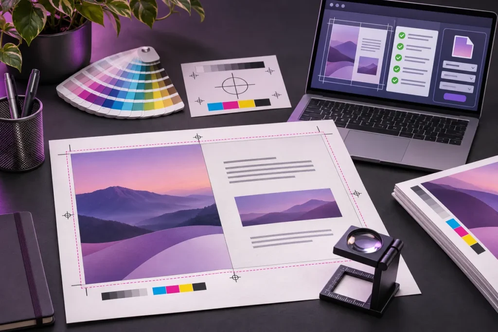
Trim is the finished size after cutting. Bleed is the extra area beyond that edge for artwork that reaches the edge. The safe area keeps essential copy, logos and contact details away from possible trimming variation.
Adobe’s current InDesign documentation explains that bleed helps prevent unwanted white gaps caused by small cutting or alignment differences. It identifies 3 mm as a common commercial value, but the exact requirement should be confirmed with the printer. Large-format, die-cut and specialist jobs may need a different allowance.
Extend backgrounds, photographs and edge-to-edge shapes to the bleed boundary. Keep important elements inside the provider’s safe margin. Treat folds, perforations and binding allowances as separate guides rather than visible decoration.
3. Build the correct page structure
A one-page poster and a facing-page catalogue need different document structures. For multipage work, prepare pages in normal reading order unless the printer explicitly requests imposed spreads. Use master pages to manage consistent margins, page numbers and recurring elements.
Evaluate covers, inner pages and inserts according to their own production specifications. Saddle stitching, perfect binding and spiral binding can require different inner clearances. Confirm that the final page count suits the selected binding method.
4. Plan colour management, not only colour mode
“Convert everything to CMYK” is not a complete colour workflow. CMYK appearance changes with the press, paper, ink and ICC output profile. Adobe’s colour-management documentation describes ICC profiles as device colour-space descriptions used to translate colour between production devices.
Ask the print provider for the required output profile and accepted PDF settings. If no profile is supplied, confirm the intended printing standard before converting artwork. Avoid repeated profile conversions, which can reduce colour quality.
Do not use an RGB screen appearance as the only reference for brand colour. Process inks, spot colours and an appropriate proof should be considered together. The brand colour palette guide provides a useful system for organising colour roles.
5. Use black according to the object
Dense four-colour black on small text or thin lines can reveal coloured shadows if plates are slightly misregistered. Use the printer’s recommended single-channel black for these elements. Large black backgrounds may use a provider-approved rich-black mix for a fuller appearance.
Total ink limits and preferred mixtures vary. Do not apply a random CMYK recipe to every job. Text, barcodes, QR codes and fine rules should receive a separate production check.
6. Check images at their placed size
Pixel dimensions alone do not define print quality. Enlarging an image in the layout reduces its effective resolution. Check actual and effective resolution, missing or modified links and colour spaces in the links panel.
Adobe’s print-ready PDF guidance recommends resolving missing fonts, overset text and low-resolution images during preflight. Although 300 ppi is a common target for continuous-tone commercial work, illustration type, large-format output and viewing distance can require different values. Confirm the correct threshold with the provider.
A web-optimised image should not automatically be treated as a print master. The web image optimisation guide offers a useful comparison of digital format and compression decisions.
7. Clean up fonts, vectors and links
Check font licences and embedding permissions before export. Missing fonts, incorrect weights and artificial styling can change the final result. Converting all text to outlines is not automatically safer: it removes editability and text information. Unless the provider requests outlines, a correctly embedded print PDF is generally a cleaner handover.
Use vector source files for logos and icons where possible. The logo file formats guide explains the roles of SVG, PDF, EPS, PNG and JPG. Remove accidental hidden objects and unused layers, while preserving production layers such as dielines or varnish according to the printer’s naming rules.
8. Choose PDF settings for the provider’s workflow
Adobe’s InDesign guidance lists presets such as Press Quality and PDF/X-4:2008, while also requiring checks for page range, bleed, colour conversion and destination profile. PDF/X is a family of print-production standards, but the correct version depends on the printer’s RIP and workflow.
Do not add every printer’s mark by default. Crop marks, bleed marks, registration marks, colour bars and page information serve different purposes. Adobe recommends confirming the expected marks with the print provider. Verify that the option to use document bleed settings is enabled during export.
9. Finish with preflight and proofing
Preflight can identify missing links, overset text, low effective resolution, unexpected colour spaces, spot colours, thin lines and font problems. Acrobat Pro’s Output Preview and Preflight tools can also inspect separations, output intent and standards compliance.
Technical checks are not enough. Read every page and verify phone numbers, email addresses, prices, dates, QR codes, page numbers and folding order. Request a digital or physical proof when appropriate. A screen preview is not a guarantee of the final printed colour.
10. Deliver an organised production package
Use a filename containing the project, size, language, date and version instead of an ambiguous “final.pdf”. Organise the approved PDF, packaged source when needed, linked images, font licence notes and production instructions in clear folders.
State the finished size, page count, colour setup, bleed, PDF standard and special finishes in the handover note. This reduces the chance of an old version being produced. Project requirements can be discussed through the contact page.
Final print-ready checklist
- Are size, stock, binding, folds and finishes approved?
- Does bleed match the printer’s requirement?
- Are copy, logos and QR codes inside the safe area?
- Are page order, cover and binding allowances correct?
- Is the required ICC output profile being used?
- Are black text and large black areas prepared appropriately?
- Are effective image resolution and links verified?
- Are fonts available, licensed and embedded correctly?
- Is there any overset text, hidden object or unintended spot colour?
- Do PDF/X version, marks and bleed settings match the workflow?
- Are preflight and visual proofreading complete?
- Is the approved version delivered with a clear filename and production note?
Print-ready artwork is the starting document for production, not merely the final design file. Making technical decisions early reduces last-minute corrections, colour surprises and reprint risk while preserving the intended visual result.