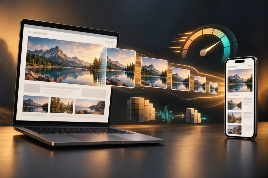
A website image should be prepared for technical delivery as carefully as it is designed. Uploading the highest-resolution export is rarely the best answer. An oversized file can make mobile visitors download unnecessary data, delay the page’s main visual and cause the layout to move while content is loading. Excessive compression creates a different problem: blurred edges, damaged gradients and weak product or brand details.
The practical goal is not to choose one “best” format for every asset. It is to match the image’s purpose, displayed dimensions and loading position with the right export and delivery method.
Start with the image’s role
A hero image, product photograph, logo, interface screenshot and decorative background need different treatment. Lossy compression can work well for photography, while sharp marks and icons may require transparency or a vector source. If promotional artwork contains text, small-screen readability must be solved in the design before compression is considered.
Ask three questions: What is the largest width at which this image will appear? Is transparency actually needed? Is the image visible immediately or only after the visitor scrolls? These answers guide dimensions, format and loading behavior.
Export for the real display size
If an image is displayed at a maximum width of 1200 pixels, uploading a 5000-pixel camera file usually adds weight without adding visible value. At the same time, high-density screens may benefit from a larger candidate. A responsive image system handles this more intelligently than sending one oversized file to every device.
The HTML srcset and sizes attributes help the browser select a suitable source for the current viewport and layout. WordPress can generate several image sizes and add responsive markup automatically. This benefit can be lost when a theme forces the original file, a page builder uses a background image incorrectly or the wrong media size is selected.
Choose formats by content, not fashion
JPEG remains a practical format for many photographs. PNG is useful when lossless edges or transparency are genuinely required, but it can be unnecessarily heavy for photography. WebP supports lossy and lossless compression as well as transparency. AVIF can also be efficient for photographs and complex gradients. The extension alone, however, does not guarantee a fast image.
Export the same source in two or more appropriate formats, compare them at an acceptable visual quality and inspect real devices. Pay attention to fine type, faces, product textures, dark gradients and brand colours. An oversized WebP file is still oversized.
Compress with visual quality control
Applying one quality value to every asset does not produce consistent results. A flat illustration and a detailed interior photograph react differently to the same encoder setting. Select the lightest version that remains visually acceptable for its real use instead of chasing an arbitrary file-size target.
Review the image at its displayed size on both mobile and desktop. Check contrast behind headings, product edges, skin tones and corporate colours. Optimization should create an intentional balance between delivery cost and visual credibility.
Treat the hero image as a priority asset
A large above-the-fold image can become the page’s Largest Contentful Paint element. Google’s performance guidance warns against delaying a likely LCP image with lazy loading. Images farther down the page can often use loading="lazy", but the same choice may hurt the main hero image.
The critical image should be discoverable early in the HTML and delivered at an appropriate size. Techniques such as preload or fetchpriority="high" can help in specific implementations, but they should be reserved for genuinely important resources rather than added to every image.
Reserve space to reduce layout shifts
When the browser does not know an image’s aspect ratio, content may jump after the file arrives. Correct width and height attributes allow the browser to reserve space before loading. CSS can still keep the image fluid; the intrinsic ratio helps the browser calculate the height. Reusable cards and galleries can also benefit from a consistent aspect-ratio system.
Write useful alternative text
Optimization also includes accessibility. Meaningful images need concise alternative text that explains their purpose in context. Alt text should not become a keyword list, a copied filename or a sales claim that the image does not communicate. Purely decorative images should be marked appropriately so they do not add noise for screen-reader users.
A practical WordPress checklist
- Resize each asset for the largest space in which it will be displayed.
- Select formats separately for photographs, transparent graphics and logos.
- Compare WebP or AVIF with the appropriate JPEG or PNG alternative at equal visual quality.
- Confirm that responsive sizes are available for mobile, tablet and desktop.
- Make sure the main hero image is not unintentionally lazy-loaded.
- Provide correct dimensions or aspect-ratio information.
- Add contextual alt text to meaningful images.
- Test the finished page on a real phone as well as with performance tools.
Optimization begins during design
A compression plugin can be useful, but it cannot repair poor mobile typography, the wrong crop, unnecessary animation or a weak visual hierarchy. Better results come from planning design, content and technical delivery together. You can review my web design and development services or use the contact page to discuss a new or existing website. The right solution should be based on measurement and visual review, not a universal promise.